
ARK Agency builds a plant-made “Emergency Exit” sign in Canary Wharf
Eden Project’s Greentime17 uses a plant-built “Emergency Exit to Nature” in Canary Wharf, linking screen-first habits to a 17-minute daily


If you have ever looked up from your phone in a busy business district and felt like the outdoors is something you will “get to later,” you are basically the audience for Greentime17.
ARK Agency has leaned into that slightly alarming, screen-first commuter reality by turning one of the most universal visual cues in public space, the emergency exit sign, into a literal “exit to nature” made from plants. The details were outlined in an official announcement.
In London’s Canary Wharf, the campaign’s centrepiece is a six by three metre living wall that recreates the fire-exit pictogram, except the running figure is heading toward trees. It is designed to make a point that Eden Project says is backed by research: 52% of UK adults now spend less than two hours a week in nature.
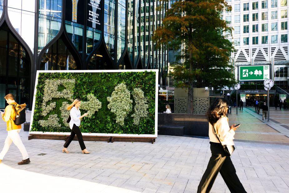
Table of contents
Jump to each section:
- What Greentime17 is really tapping into
- How the “Emergency Exit to Nature” installation works
- Why Eden Project is framing nature as a daily habit
- What this means for marketers
What Greentime17 is really tapping into
The creative idea is simple: people already know what an emergency exit sign means, and they are trained to read it fast. ARK Agency is betting that borrowing this visual language, and twisting it, can interrupt autopilot behaviour.
The campaign also borrows from familiar “screen addiction” imagery: commuters walking head-down into phones, then resolving into the message to swap screen time for “Greentime.” It is a direct attempt to reframe scrolling as the default, and stepping outside as the intentional choice.
Underneath the concept is a mental health and wellbeing subtext. ARK’s creative partner Edward Usher ties the work to both an environmental crisis and what he calls a mental health emergency, positioning time in nature as a small, repeatable behaviour change rather than a grand lifestyle reset.
 undefined
How the “Emergency Exit to Nature” installation works
The Canary Wharf installation is designed as the campaign’s physical anchor. It is a large-scale “Emergency Exit to Nature” sign constructed from drought-tolerant plants, built with reclaimed timber in partnership with Creative Giants Art Ltd.
That material choice matters to how the work reads in real life. A living wall is not just a billboard. It looks and feels like a piece of nature inserted into a finance-and-transit environment, which makes the message harder to dismiss as purely symbolic.
The campaign extends beyond the installation into:
- Out-of-home placements across 48-sheets, six-sheets, and digital screens
- An animated social series
- Video content documenting the build and public reaction
Eden Project also notes the installation is temporary: it runs in Canary Wharf until Thursday 10th September, after which the plants will be gifted to the public or rehomed at Eden Project in Cornwall. That ending creates a second narrative beat: the piece does not just “go away,” it disperses.
Why Eden Project is framing nature as a daily habit
Greentime17 is Eden Project’s push to make 17 minutes a day in nature feel as routine as other health benchmarks like five-a-day or 10,000 steps.
It is also positioned as the public-facing layer of a larger programme: Nature: Connections and Recovery, described as a three-year, multi-partner effort backed by The National Lottery Climate Action Fund, the Ashken Family Foundation and Bupa Foundation.
Eden Project CEO Andy Jasper frames the issue as a “fragmented relationship with the natural world” that affects human health and the natural world that “feeds and clothes us.” In that context, the emergency-exit metaphor is less about shock value and more about clarity: nature is not a luxury add-on, it is presented as a basic support system.
What this means for marketers
This campaign works because it treats attention like the real battleground, not awareness.
- Use a visual shortcut people already understand
The exit sign pictogram is almost universal, which means the idea lands quickly. Marketers can take note: the fastest creative is often built on shared visual literacy, not new brand language. - Make the behaviour change feel small, not aspirational
“17 minutes a day” is specific and approachable. It avoids the trap of telling people to become a different person, and instead asks for a repeatable micro-shift. - Let the physical world carry part of the message
A plant-built sign in a dense commercial district is inherently contrastive. For brands, this is a reminder that “OOH” can be more than a media buy when the object itself embodies the point. - Design an ending that extends the story
Rehoming or gifting the plants turns the installation into a distributed afterlife. That is a tactic that can make a one-location build feel like it has broader reach without claiming mass scale.
Greentime17 is also a signal about how wellbeing messaging is evolving. It is moving away from vague self-care language and toward concrete, trackable rituals that fit into the way people already measure their lives.
For marketing teams, the broader lesson is that behaviour-first campaigns tend to feel less preachy. Instead of telling people what they should value, they show what people are doing now (screen-first living), then offer a simple alternative that feels emotionally and socially plausible.