Lay’s rebrand puts the potato first
Lay’s latest brand overhaul celebrates its potato roots and signals a shift toward ingredient-first storytelling

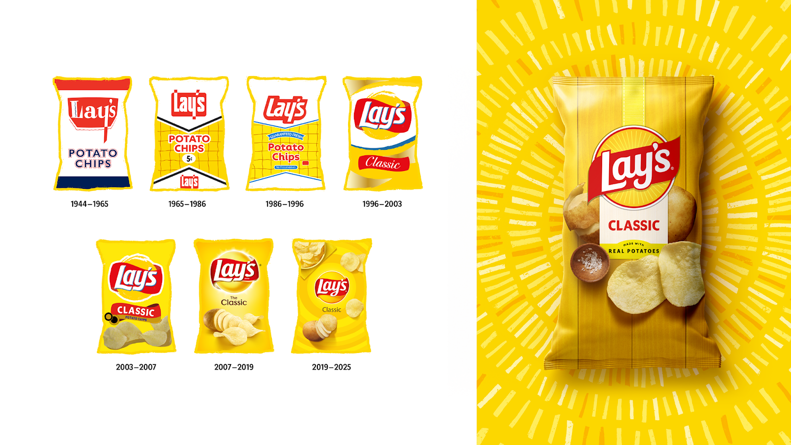
Lay’s just peeled back the layers of its identity, unveiling the biggest brand redesign in its nearly 100-year history. This rebrand is not just a visual upgrade. It is a strategic move to reframe the narrative around real ingredients and where they come from.
This article explores how Lay’s is reconnecting with its roots, what this shift signals for marketers in food and FMCG, and how brands can leverage similar strategies to meet evolving consumer expectations.
Short on time?
Here’s a table of contents for quick access:
- Lay’s redesign: what’s new
- A potato-powered narrative shift
- Clean-label ambitions and ingredient reformulations
- What marketers should know

Lay's redesign: what's new
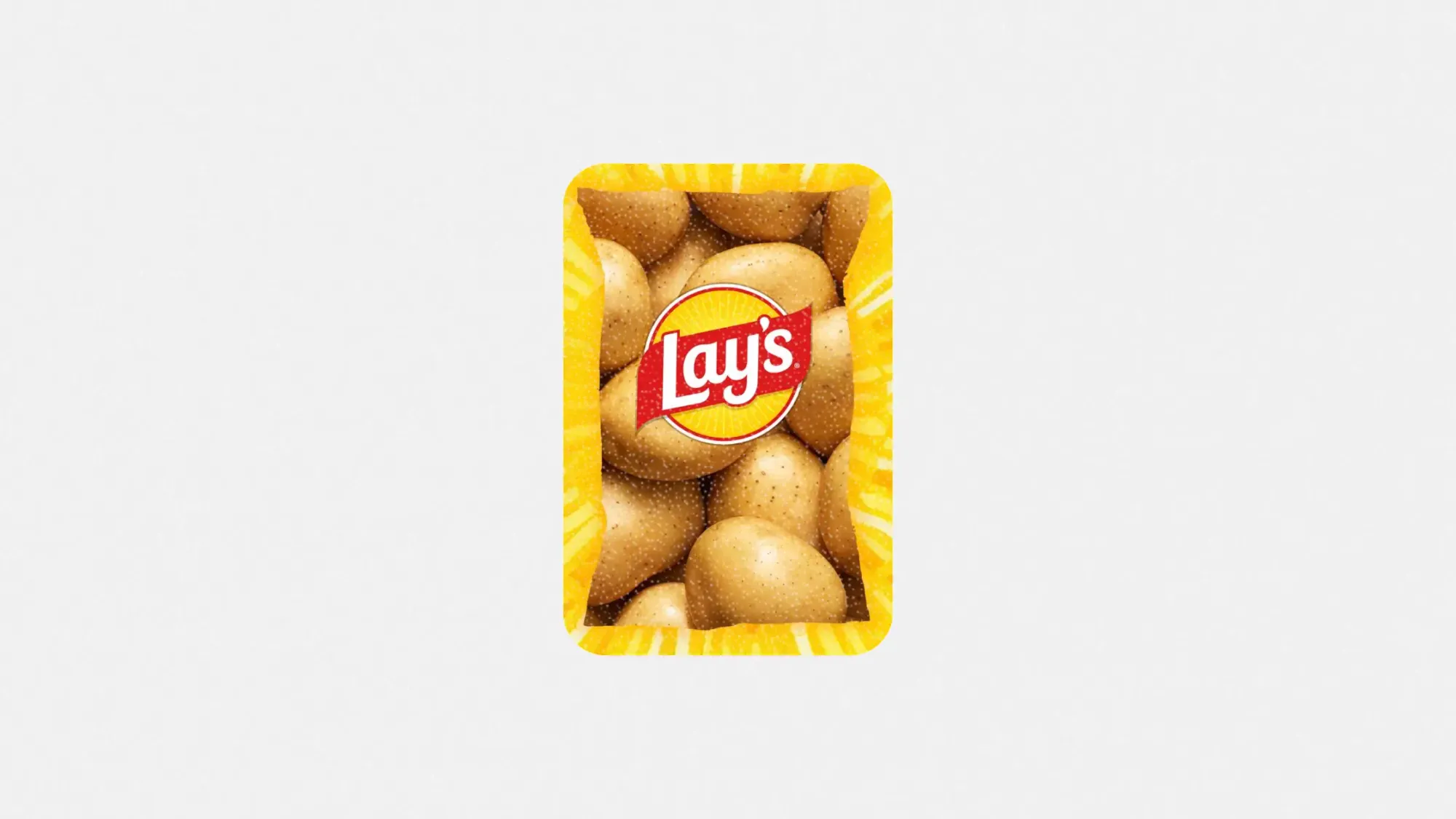
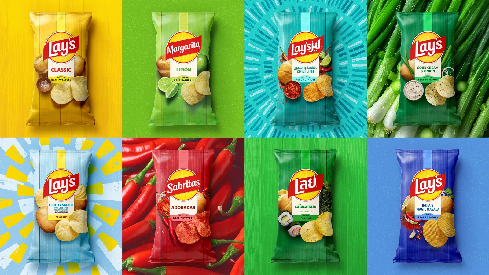
PepsiCo’s in-house design and innovation team led the overhaul, keeping Lay’s iconic yellow sun while warming it up with a new glow and radiating “Lay’s Rays” from the center. The sun motif now echoes the source of growth for its crops. The updated packaging introduces a more ingredient-inspired color palette with tones like pickle green and hickory brown.
The classic red ribbon remains in place, anchoring the new look with trust cues consumers recognize. Photography has been tightened and made more tactile, using close-up shots to highlight chip texture and crispness.
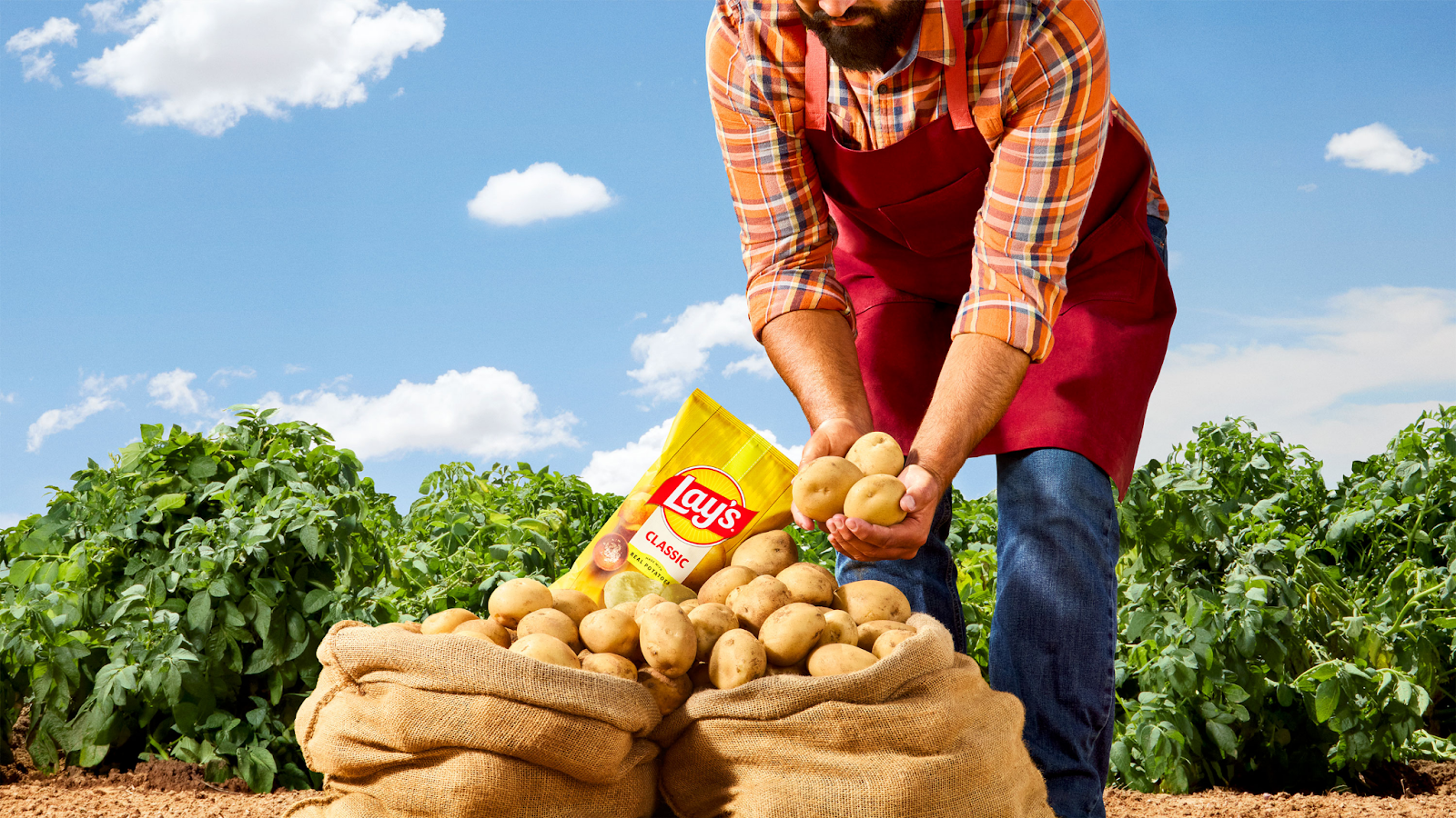
This design refresh supports a broader narrative strategy. Lay’s is highlighting its agricultural origin story, citing partnerships with over 100 family-owned farms across North America and ingredient sourcing across 60 countries. During harvest season, potatoes can go from soil to bag in as little as 48 hours, a detail now emphasized in its messaging.
A potato-powered narrative shift
Lay’s is no longer just marketing flavor. It is marketing its supply chain.
This rebrand doubles down on storytelling that prioritizes provenance. The 2024 Super Bowl ad featuring a “Little Farmer” was an early clue, and the new visual identity takes it further by placing farmers and ingredients at the core of the brand’s story.
For marketers, this signals a return to fundamentals. In a cluttered snacking category, storytelling rooted in origin and authenticity offers stronger differentiation than just limited-time flavors or flashy partnerships.
Carl Gerhards, PepsiCo’s senior design director, called the redesign the brand’s most significant in nearly a century. He noted that the system was built for flexibility across global markets while keeping Lay’s signature cues intact.
Clean-label ambitions and ingredient reformulations
Lay’s is not just changing what consumers see. It is changing what they eat.
By the end of 2025, all core Lay’s products in the US will eliminate artificial flavors and colors from artificial sources. Lay’s Baked line will switch to olive oil and contain 50 percent less fat. The Kettle Cooked Reduced Fat Original Sea Salt chips will be made with avocado oil and offer 40 percent less fat. Updated recipes for the brand’s white dips are expected in early 2026.
Denise Truelove, Senior Vice President of Marketing at PepsiCo Foods US, said these moves were shaped directly by consumers. She emphasized that Lay’s goal is to offer more choice and transparency while continuing to deliver the taste customers trust.
These changes reflect an industry-wide shift toward clean-label products. Even in indulgent categories like chips, consumers are reading labels more closely. The opportunity for brands is to use transparency not just as a compliance measure but as a competitive advantage.
What marketers should know
Here are four key takeaways for marketers following Lay’s lead:
1. Ingredient storytelling adds brand value
Lay’s reframed its core ingredient into a narrative asset. Brands that want to differentiate should think about how to spotlight their own supply chains or origin stories in ways that build consumer trust.
2. Design updates should respect brand equity
Lay’s kept key brand identifiers while modernizing its packaging. The result is a fresh look without confusing the customer. For marketers considering a redesign, consistency is not a constraint. It is an asset.
3. Align product and brand evolution
Visual storytelling is more powerful when backed by actual product change. Lay’s rebrand coincides with cleaner recipes. Brands should make sure their visual and product roadmaps move in sync.
4. Clean-label is now table stakes
Consumer expectations have moved. Artificial ingredients are under pressure. Even legacy snack brands are reformulating. If your product is not meeting evolving label expectations, it risks becoming irrelevant.
Lay’s rebrand reflects more than aesthetic change. It represents a strategic move toward storytelling built on ingredients, process, and transparency.
For food marketers, this is a wake-up call. Legacy brands cannot rely on loyalty alone. They must evolve to meet a consumer base that wants to know not just what is in the bag but how it got there.
Marketers who embrace this shift will be better positioned to build trust, stand out on the shelf, and lead the next chapter of food branding.