PepsiCo gets a bold new look after 25 years, but it's more than a design update
PepsiCo’s corporate refresh connects the dots between consumer trust and brand equity

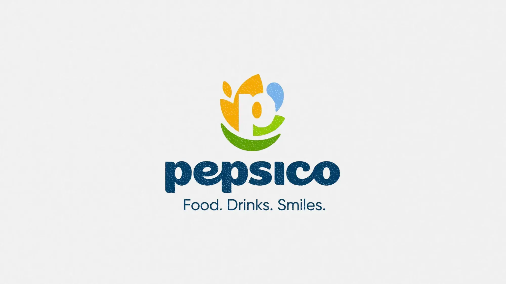
PepsiCo has unveiled its first global brand refresh in nearly a quarter century. But this isn’t just a visual facelift. The corporate rebrand aims to reshape how the company is perceived, both by consumers and the business world, while reinforcing PepsiCo’s evolving position as a modern, innovation-driven food and beverage giant.
This article explores what’s changed in the brand identity, why it’s happening now, and what the update signals for marketers navigating perception, portfolio strategy, and sustainability messaging.
Short on time?
Here’s a table of contents for quick access:
- What’s new in the PepsiCo rebrand
- The real reason behind the corporate refresh
- What marketers should know

What's new in the PepsiCo rebrand
The refresh includes:
- A new logo with bold, modern elements
- A revised color palette
- A custom, lowercase typeface designed to signal approachability and a more human tone
PepsiCo says the new identity reflects its evolution into a “forward-thinking” and “consumer-obsessed” company. The company’s updated branding brings its visual language closer to that of its consumer-facing brands such as Gatorade, Quaker, Tostitos, Siete, and poppi.
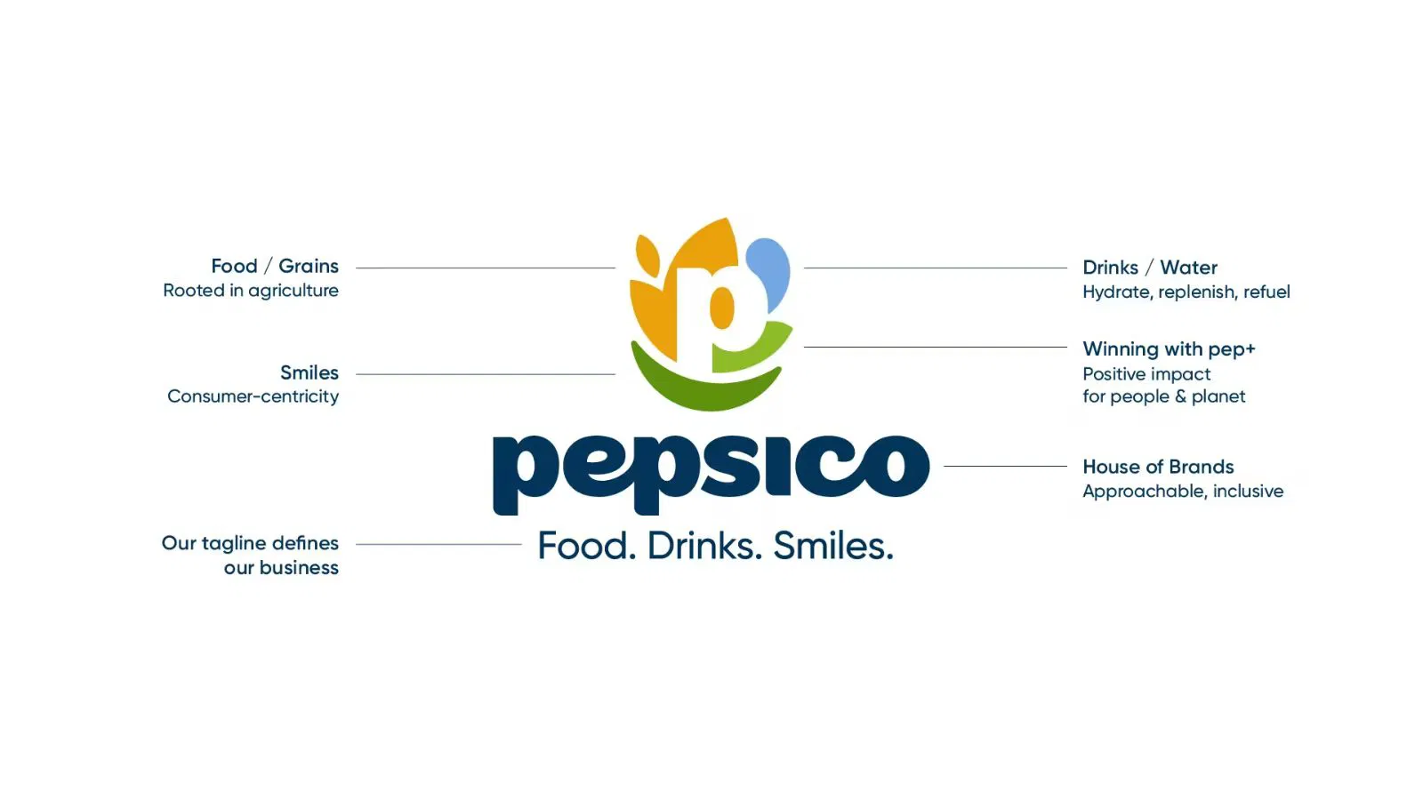
The custom typography and revamped design also align with the company’s pep+ (PepsiCo Positive) agenda, which emphasizes health, innovation, and sustainability as long-term brand values.
The real reason behind the corporate refresh
Only 21% of consumers could name a PepsiCo brand other than Pepsi, according to internal research. That’s a strategic visibility gap for a company with more than 500 brands in its portfolio.
This rebrand is PepsiCo’s attempt to close that gap.
By bringing its corporate identity closer to its consumer brands, PepsiCo is shifting from a low-profile parent company to a more unified and recognizable brand family. Jane Wakely, Chief Consumer and Marketing Officer, described the redesign as “a beautiful expression” of where the company stands today and where it’s headed next.
The move follows Lay’s own visual refresh earlier this month, its most significant redesign in nearly 100 years. That update, led by PepsiCo’s in-house design team, put the focus back on the potato and emphasized themes like authenticity and natural sourcing.
What marketers should know
PepsiCo’s rebrand offers three takeaways for brand strategists and marketers:
1. Corporate visibility needs a rethink
In a marketplace where people increasingly connect with brand values over corporate logos, businesses with large portfolios must close the gap between consumer experience and corporate identity. The new PepsiCo look is designed to bridge that disconnect.
2. Branding is doing the job of strategy
This refresh is not a surface-level update. The design itself is carrying strategic messaging. The lowercase font and smile-centric visuals are crafted to express warmth, optimism, and accessibility—values PepsiCo wants associated across its ecosystem.
3. Brand architecture is now a business issue
This update is a signal for marketers to revisit how their brand portfolios are structured. As consumers demand more transparency and alignment, marketing teams must assess whether their architecture tells a clear and cohesive story across all touchpoints.
PepsiCo’s new identity isn’t just about a cleaner logo. It marks a broader shift toward visibility, cohesion, and purpose across a massive brand empire. It reflects how a legacy company is recalibrating to meet modern expectations—where design and strategy are inseparable.
For marketers, the lesson is clear. Visual identity isn’t cosmetic. It’s how your strategy shows up in the world.