Domino’s turns up the crave factor with first brand refresh in 13 years
Domino’s goes bold with new packaging, sound logo, and identity. Here’s how it plays into modern brand strategy

Domino’s is back in the spotlight, but not for a wild pizza topping or delivery stunt. This time, it's all about branding.
The global pizza chain has unveiled its first full brand refresh in 13 years, and it's designed to make every customer interaction, from the pizza box to the app interface, feel more craveable.
This article explores Domino’s bold rebrand, what it says about the brand’s positioning in today’s experience-driven food market, and what B2B marketers can take away about crafting emotional, memorable brand moments.
Short on time?
Here’s a table of contents for quick access:
- What Domino’s changed in its brand identity
- Why now? Strategic context for the refresh
- What marketers should know
What Domino's changed in its brand identity
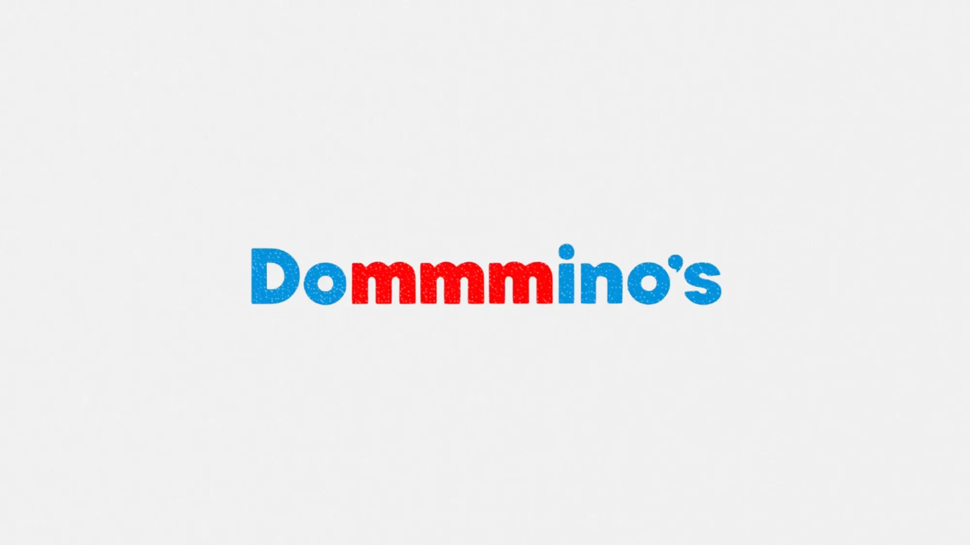
The refresh spans every sensory touchpoint. Visually, Domino’s introduced brighter colors, updated its packaging, and rolled out a new custom typeface called “Domino’s Sans.” The goal is to make the brand look as craveable as its products.
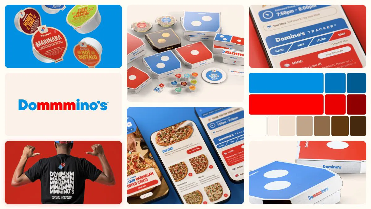
But the biggest move may be sonic. The company launched its first-ever audio brand asset: a jingle voiced by Grammy-nominated artist Shaboozey. Called “Dommmino’s,” the elongated pronunciation of the brand name was intentionally crafted to spark a mouth-watering association every time it's heard.
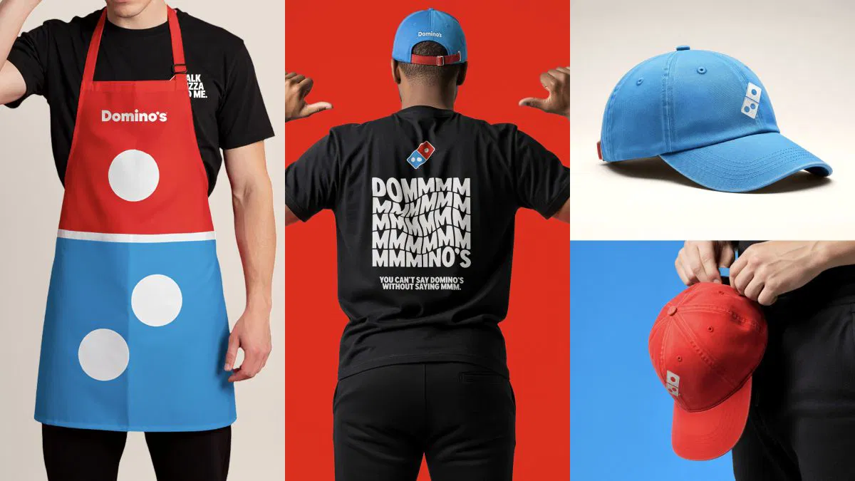
There’s also a strong focus on cohesion. Team uniforms, in-store experiences, digital interfaces, and even delivery interactions are being redesigned for brand consistency and sensory appeal.
Why now? Strategic context for the refresh
Domino’s Chief Marketing Officer Kate Trumbull made one thing clear. This isn’t a rebrand born of crisis. “Most companies rebrand when they’re struggling,” she said. “We’re doing this after years of category-defying growth.”
In other words, this is a brand doubling down, not turning things around.
For years, Domino’s leaned heavily into its image as a tech-forward company that happened to sell pizza. The new strategy, titled “Hungry for MORE,” flips that script by re-centering the brand around craveability and emotional connection.
As Trumbull puts it, “Rather than launching a traditional tagline, we’re baking craveability right into our name and every aspect of our brand.”
What marketers should know
So what can brand strategists, marketing leads, and creative teams actually take away from all this? Domino’s isn’t just updating its look. It’s making a strategic bet on emotional branding, multisensory design, and experience-led marketing. Here are five key takeaways worth noting.
1. Craveability is a branding strategy, not just a product feature
Domino’s isn’t just selling pizza anymore. It’s selling a feeling. The refresh plays to sensory branding at every level: visuals, voice, packaging, and even typography. For marketers, this is a reminder that emotional triggers like taste, sound, and design can work together to create stickier brand associations.
2. Sonic branding is moving mainstream
The new “Dommmino’s” jingle reflects a broader trend. Audio branding is no longer just for car ads or soda commercials. In an increasingly screen-less world of smart speakers and voice assistants, a recognizable audio cue can be just as important as a logo.

3. Consistency across touchpoints builds stronger brand memory
From in-store experiences to mobile UX, Domino’s is aligning every customer-facing element under a singular, crave-worthy identity. For B2B marketers, this reinforces the need for brand coherence not just across channels but across senses.
4. Brand updates don’t have to follow crisis
Marketers often wait until performance dips before refreshing their brand. Domino’s proves that strong brands can rebrand from a position of strength, using momentum as fuel rather than waiting for decline.
5. The food industry is a testbed for emotional branding
Pizza Hut has also refreshed its look recently, signaling that fast-food players are investing heavily in emotional recall and identity, not just product innovation. For non-food marketers, the takeaway is clear. Emotion and identity drive decisions in every category, even in B2B.
Domino’s isn’t just changing its packaging. It’s changing how customers feel about its brand. In an economy where attention is fleeting and experience is king, craveability may just be the new currency of brand relevance.
For marketers, the move underscores a larger trend. The most effective brands today don’t just communicate. They stimulate.