Pantone picks ‘Cloud Dancer’ as 2026 Colour of the Year
Pantone’s latest colour pick is more than aesthetic. It’s a blueprint for multisensory marketing

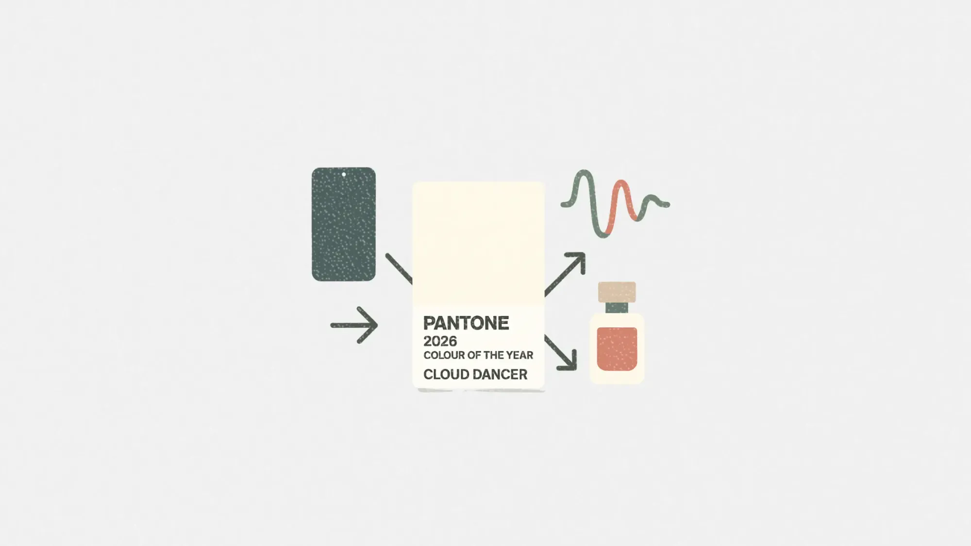
Pantone has officially announced its Colour of the Year for 2026: PANTONE 11-4201 Cloud Dancer, a soft, airy white that aims to inspire calm, clarity, and creative reset. But this year’s announcement isn’t just about hue. It’s about cross-category storytelling, and Pantone is bringing the whole world along for the ride.
From smartphones and stationery to fragrances and typography, Pantone is transforming its annual colour reveal into a global collaboration strategy. With partners like Motorola, Spotify, and Mandarin Oriental, the company is turning a single colour into a multisensory, multimarket brand moment.
This article explores how Pantone’s Cloud Dancer is already shaping campaigns in tech, lifestyle, and interiors — and what marketers can learn from this kind of soft-power, high-impact rollout.
Short on time?
Here’s a table of contents for quick access:
- What is Cloud Dancer and why it matters
- Pantone’s global collab playbook: key brand activations
- What marketers should take from Pantone’s colour strategy
What is Cloud Dancer and why it matters
Described as a “whisper of calm and peace,” Cloud Dancer is positioned as a visual reset for overstimulated eyes and minds. Pantone says the hue invites serenity without feeling cold or clinical. It’s ideal for design environments that aim to soothe, declutter, or encourage contemplation.
According to Leatrice Eiseman, Executive Director of the Pantone Color Institute, the shade offers “a promise of clarity.” Meanwhile, Laurie Pressman, Vice President of the Institute, links the colour to the blurred lines between physical and digital spaces. Cloud Dancer is a springboard for new modes of creative expression.
For marketers, this sets up an opportunity. Cloud Dancer isn’t just a visual choice. It’s a psychological one, tapping into consumer cravings for stillness, intentionality, and emotional relief.
Pantone's global collab playbook
Pantone’s colour picks often ripple across fashion and beauty, but 2026 takes things further. This year’s partnerships expand into tech, scent, sound, and even spatial experiences.
Spotify enters the chat musically
For the first time, Pantone is pairing colour with music. Spotify’s Cloud Dancer playlist personalizes tracks based on your listening habits, offering a curated sonic escape that mirrors the colour’s meditative theme. It's a smart cross-sensory move that anchors emotion in both sight and sound.
Motorola brings calm to your pocket
The motorola edge 70 is being reimagined in Cloud Dancer, with a quilted vegan leather finish, Swarovski crystal detailing, and what Pantone calls “serenity in your pocket.” The aim is to merge luxury aesthetics with tactile calmness, giving smartphones a softer emotional appeal.

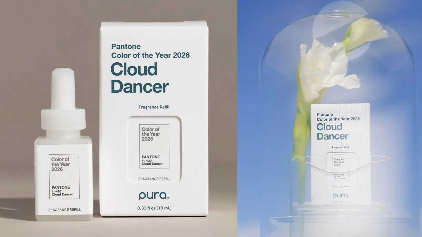
Pura captures Cloud Dancer in scent
Pura translates the hue into fragrance, crafting a scent experience that mirrors the tone of Cloud Dancer — calm, clean, and clarifying. This marks a move into scent-based branding, tapping into the growing demand for immersive lifestyle cues.
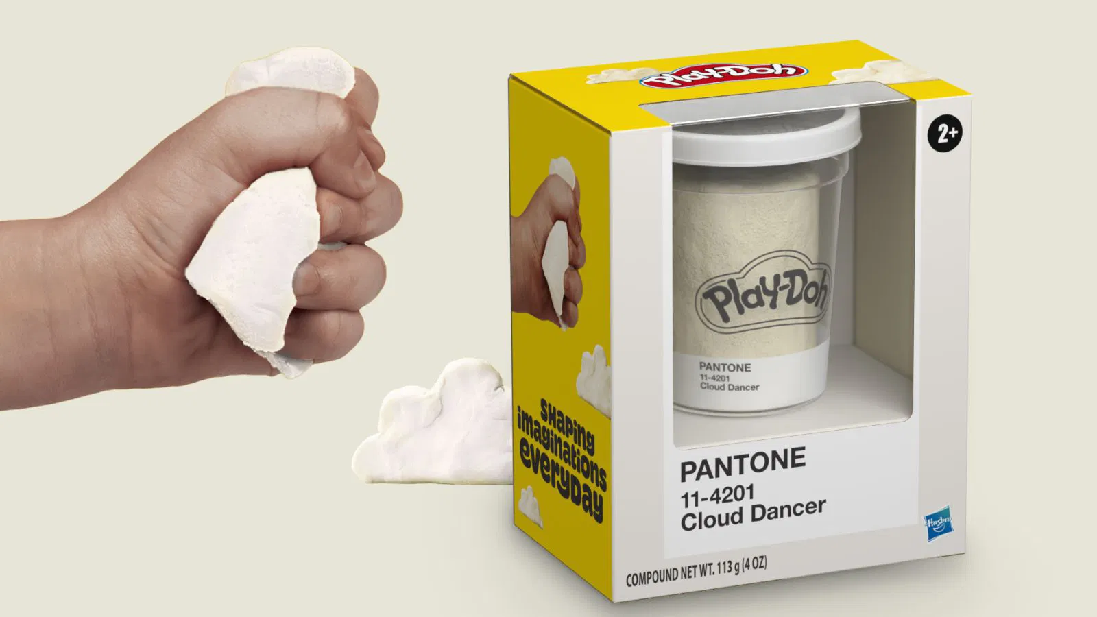
From Play-Doh to Post-its
Play-Doh’s 70th anniversary edition in Cloud Dancer turns a childhood toy into a mindfulness tool, inviting users to slow down and create. Meanwhile, Post-it's new Neutrality Collection features the hue to help bring order and calm to cluttered desks.
Mandarin Oriental turns colour into hospitality
Ten luxury hotels under the Mandarin Oriental umbrella are incorporating Cloud Dancer across spa treatments, seasonal decor, and even themed letters to Santa. It’s colour as customer experience, executed with restraint and elegance.

Typography joins the movement
Partnering with Monotype, Pantone created its first typographic response to the Colour of the Year. Paired with the “Jensen Arabique” typeface, the design choice reflects the colour’s understated sophistication, extending its influence into visual communication and branding assets.

What marketers should take from Pantone's colour strategy
Pantone’s Cloud Dancer launch isn’t just about a shade. It’s a case study in brand storytelling, sensorial branding, and cross-industry momentum. Here’s what marketers can learn:
1. Use colour as a strategic narrative device
Cloud Dancer isn’t framed as “just white.” It’s clarity, calm, and contemplation — wrapped in a hue. Marketers can take notes on how to embed emotional resonance into colour decisions and build richer narratives around visual choices.
2. Extend campaign relevance through multisensory brand touchpoints
From fragrance and texture to music and typography, Pantone proves that colour isn’t limited to visual channels. Marketers should consider how brand messages can live across sensory modalities to deepen audience engagement.
3. Leverage limited editions to drive urgency without hype
From Post-its to Play-Doh, Pantone’s limited Cloud Dancer editions tap nostalgia and collectibility. This approach boosts emotional stickiness while keeping the execution grounded and accessible.
4. Collaborate across industries to expand brand reach
Pantone’s partnerships span tech, lifestyle, hospitality, and design. Smart marketers can explore how cross-category collabs not only add depth to brand stories but also unlock new audiences without diluting the core message.
Pantone has turned Cloud Dancer into more than a colour trend. It’s a sensory campaign platform that repositions simplicity as a premium experience. By tapping into calm and clarity, Pantone has cracked the code on how to make a soft shade land loud across global markets.
Marketers looking to inspire, not overwhelm, would do well to watch how this quiet white carries a loud message through smart partnerships and emotionally attuned execution.