
Spotify’s disco ball logo sparked a branding trend, and marketers should pay attention
Spotify’s glittery anniversary logo accidentally became a masterclass in social-first brand engagement

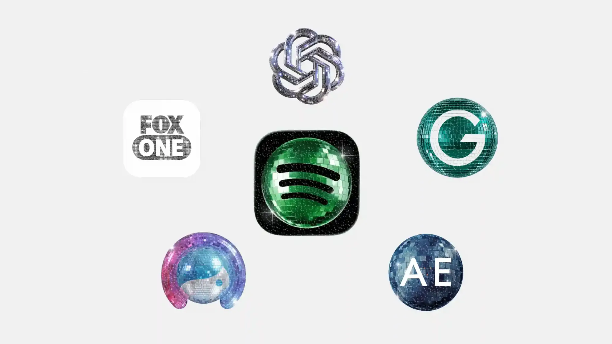
Spotify’s 20th anniversary campaign was supposed to be a nostalgic trip through users’ listening habits. Instead, the internet became obsessed with something much shinier: the company’s temporary disco ball logo redesign.
What started as a playful anniversary icon quickly turned into a broader social media phenomenon. Brands across tech, media, fashion, and creator platforms began swapping their logos for glitter-covered disco ball versions, embracing the chaotic energy of a trend that was simultaneously mocked, memed, and celebrated online.
For marketers, the bigger story is not whether people liked the disco logos. It’s that people noticed them. In an era where audiences scroll past polished brand messaging in seconds, temporary visual identity changes are becoming a low-cost way to trigger conversation, participation, and algorithmic visibility.
Table of contents
Jump to each section:
- Why Spotify’s disco ball logo became internet bait
- Which brands joined the disco logo trend
- Why temporary logo redesigns work so well on social media
- What marketers should learn from the disco logo moment
- Will brands keep turning logos into content?
 Patrecia Meliana
Why Spotify's disco ball logo became internet bait
Spotify’s temporary anniversary logo redesign landed directly in the middle of internet culture’s current obsession with irony, nostalgia, and playful visual chaos.
Some users loved the glittery disco-ball aesthetic. Others called it ugly, distracting, or aggressively unserious. Naturally, that made it perfect for social media.
The redesign spread rapidly across X, Instagram, and TikTok as users posted reactions, memes, screenshots, and commentary about the icon. Instead of debating Spotify’s actual anniversary campaign, audiences focused on the logo itself, effectively turning a simple design update into a viral engagement engine.
Spotify leaned into the reaction cycle rather than resisting it. After criticism started piling up, the company jokingly posted: “Alright, we know glitter is not for everyone.” That response mattered. Brands that successfully ride visual internet trends rarely over-explain themselves. They let audiences argue, remix, and amplify the moment for them.
Which brands joined the disco logo trend
Once Spotify’s disco icon started dominating timelines, other brands quickly joined in.
Some of the most visible participants included:
1. American Eagle
2. ChatGPT
3. Facetune
4. FOX One
5. Grammarly
Each brand adapted the disco aesthetic slightly differently, but the core strategy remained the same: temporarily transform a familiar visual identity into something culturally reactive and highly shareable.
Google took things even further by introducing disco-themed Android app icons for Pixel devices. Android ecosystem president Sameer Samat joked on X: “Your wish is our command. Disco icons available on Pixel as of today … Are y’all sure you still want this?”
Your wish is our command. Disco icons available on Pixel as of today.
— Sameer Samat (@ssamat) May 22, 2026
... Are y'all sure you still want this ?? 😅@DurvidImel @RaceJohnson https://t.co/S9dwLZRtHl pic.twitter.com/nvevL7fTSb
The redesigns intentionally leaned into kitsch. That was part of the appeal.
For younger audiences especially, polished corporate branding increasingly struggles to generate emotional reactions. Weirdness performs better. So does self-awareness.
Why temporary logo redesigns work so well on social media
Temporary logo revamps are not new, but social platforms have changed how valuable they can become.
Years ago, seasonal logos or campaign-themed branding mainly lived on websites and advertisements. Today, app icons and profile pictures function more like social content themselves.
A temporary redesign can:
- Trigger screenshots and reposts
- Encourage user-generated memes
- Signal cultural participation
- Create “in-group” internet moments
- Generate earned media coverage far beyond the campaign itself
Most importantly, temporary visual changes interrupt audience familiarity. Consumers are trained to ignore static brand visuals. But when a recognizable logo suddenly changes, even slightly, people pause long enough to react. That pause is valuable.
Spotify’s disco icon demonstrates how even negative reactions can fuel reach. Many users hated the redesign, but they still shared it, discussed it, and amplified it.
That dynamic matters because modern engagement algorithms rarely distinguish between admiration and irritation. Visibility is visibility.
What marketers should learn from the disco logo moment
The disco-ball logo trend highlights several useful lessons for marketing teams navigating social-first brand building.
1. Brand identity is becoming more fluid
Consumers increasingly expect brands to adapt visually in real time. Static identity systems still matter, but temporary aesthetic experimentation now feels normal rather than risky.
2. Participation often matters more than polish
Some of the disco logos looked intentionally ridiculous. That was the point.
Social media rewards brands that appear culturally present, not necessarily visually perfect.
3. Internet culture favors remixability
Spotify accidentally created a format other brands could easily imitate. The easier a trend is to replicate, parody, or personalize, the faster it spreads.
4. Temporary branding can become earned media
A simple app icon redesign generated coverage across social media, tech publications, and marketing conversations without requiring a major product launch.
For marketers facing shrinking attention spans and rising ad costs, lightweight visual participation campaigns can deliver outsized awareness.
5. Whimsy is having a moment
Several analysts have pointed to growing “playful escapism” online, especially among younger audiences navigating economic stress, burnout, and algorithm fatigue.
Absurd branding trends fit neatly into that cultural shift.
Will brands keep turning logos into content?
Probably.
Logos are no longer just identifiers. On social media, they function like active media assets capable of driving conversation on their own. That changes how marketers should think about visual identity systems moving forward.
Instead of treating logos as untouchable corporate symbols, more brands are experimenting with them as flexible cultural touchpoints. Some redesigns will fail. Others will get roasted. But many will succeed simply because audiences cannot resist reacting to them.
Spotify’s disco-ball icon may not win design awards, but it achieved something many campaigns fail to do: it made people stop scrolling. And increasingly, that is the entire game.