Google updates its iconic "G" for the AI era
A subtle icon shift with major implications for product branding and perception

Google has refreshed its iconic four-color “G” logo with a brighter, more gradient-heavy design that reflects the company’s shift into its AI-first future. While the change might seem subtle at first glance, it signals a broader branding evolution that marketers should pay attention to.
This article explores the reasoning behind the design change, how it connects to Google’s evolving product strategy, and what marketers can take away from this update as they future-proof their own brand identities.
Short on time?
Here is a table of content for quick access:
- What’s new with the Google “G”?
- Google’s logo has always mirrored product strategy
- What marketers should know
- Logo refreshes are trending in 2025
What's new with the Google "G"?
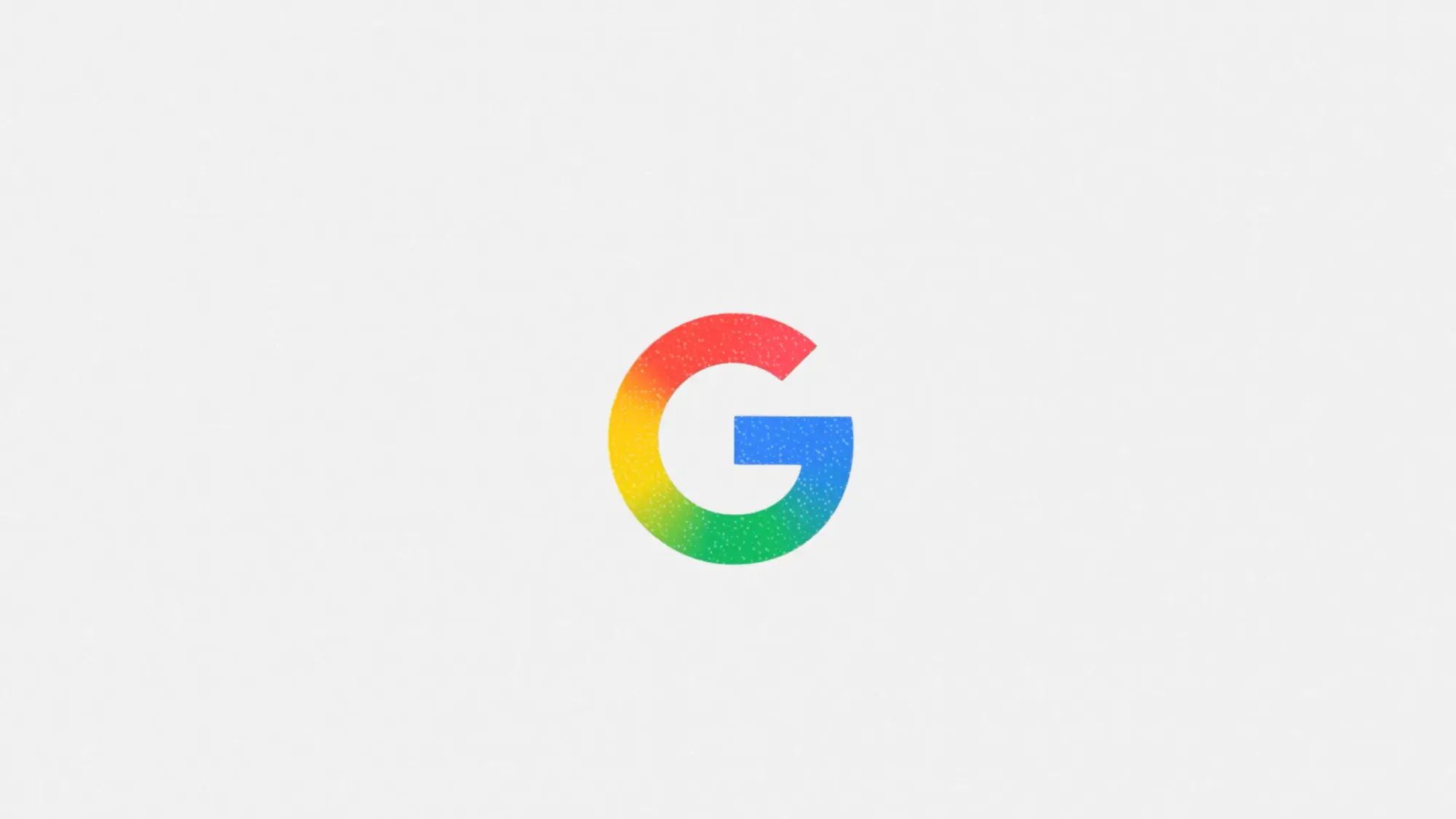
The redesigned “G” now features bolder colors and a four-color gradient that gives the icon a sense of depth and movement. According to Google, the update symbolizes the energy and innovation brought by its growing suite of AI-driven tools and services.
Initially introduced earlier this year within Google Search, the updated logo is now rolling out across more of the company’s platforms. The rollout began in June with Gemini Spark, and Google plans to extend it to other services in the coming months.
Despite the visual refresh, the design retains Google’s familiar color palette of blue, red, yellow, and green. It’s a continuation of the company’s long-standing visual identity rather than a full departure.
Google's logo has always mirrored product strategy
This isn’t the first time Google has retooled its visual identity to align with how users interact with its technology. Back in 2015, the company introduced a major rebrand to reflect the shift from desktop-centric usage to a multi-device experience. That update included the introduction of the sans-serif logotype and the original four-color “G” as a compact brand icon.
It also marked a broader move toward a responsive, real-time design system. Visual elements like the multicolored microphone and dynamic dots were added to support new interaction patterns, such as voice input and gesture-based navigation.
Fast forward to 2025, and Google’s update again reflects the changing nature of user interaction—this time driven by AI integration and cross-platform intelligence. The new “G” is a visual cue that the company is evolving from a search-first utility to a real-time, AI-powered ecosystem.
What marketers should know
Google’s subtle logo shift offers more than just design inspiration. It’s a playbook in visual storytelling, brand alignment, and strategic communication. Here’s what marketers can take away from the update:
1. Design changes are brand signals
Google’s refresh is not just about aesthetics. The gradient and increased saturation reflect transformation and momentum. For marketers, this is a reminder that subtle design updates can effectively signal product shifts, strategic direction, or company vision.
If your brand is pivoting into AI or launching new innovations, your visual identity should evolve accordingly. Small changes, if intentional, can communicate big things.
2. Visual scalability still matters
Google’s “G” shows up in places as small as browser tabs and smartwatch icons. This redesign reinforces how a scalable design system is critical for visibility across screen sizes and touchpoints.
For brand teams, this is a cue to audit how your logo performs in micro and macro environments. A strong identity should remain recognizable and functional whether it’s on a billboard or an app icon.
3. Evolution beats reinvention
Google didn’t scrap its old identity. It enhanced it. Marketers managing legacy brands should take note. You don’t always need a total rebrand. Instead, evolve key visuals to reflect new capabilities or strategic priorities while maintaining brand equity.
Consistency builds trust, but thoughtful evolution shows relevance. This balance is crucial in fast-moving sectors like tech, fintech, and martech.
Logo refreshes are trending in 2025
Google joins a growing list of companies embracing identity redesigns to reflect future-focused strategies. Bentley Motors recently modernized its iconic “Winged B” emblem to signal a shift toward electric innovation. Great Eastern, Singapore’s oldest life insurer, also refreshed its lion logo to align with a digital-first vision.
These updates serve as reminders that design is more than visual polish. It is a public-facing expression of transformation. For marketers, it’s worth watching how legacy companies are using brand updates to narrate the next chapter.
Google’s new “G” may look like a minor update, but it represents a larger story about brand evolution in the age of AI. For marketers, it’s a clear signal that design, positioning, and technology must move in sync.
As AI continues reshaping product experiences, brand visuals will need to keep pace. Whether you’re leading a rebrand or tweaking your identity, remember: design is strategy made visible.