Pizza Hut revives classic logo with a twist
From slanted typography to plush garlic bread toys, Pizza Hut is refreshing its image worldwide.

Pizza Hut is dialing up brand consistency across global markets with a newly refreshed logo, quietly introduced in August across the UK, Canada, and South Africa. The new design leans into the past while signaling forward motion. The iconic red roof remains, but the typeface now features a slanted, italic look that gives it a dynamic, energetic edge.
This rollout may look cosmetic at first glance, but it speaks volumes about how legacy brands like Pizza Hut are evolving their visual identity to align with today’s consumer expectations while maintaining recognizability. For marketers, this is a textbook example of strategic brand unification and it’s worth a closer look.
This article explores the new brand direction, how it's being amplified through high-profile campaigns and quirky local activations, and what it all means for marketers managing global-to-local brand strategies.
Short on time?
Here is a table of content for quick access:
- What’s new in Pizza Hut’s refreshed logo?
- Enter Dr. .Paak: how Pizza Hut is tying in cultural relevance
- Local campaigns show how brand refresh plays out on the ground
- What marketers should know
What's new in Pizza Hut's refreshed logo?
The revamped logo sticks to Pizza Hut’s iconic red roof visual but introduces a sleeker font that tilts forward, suggesting motion and energy. The update draws inspiration from Pizza Hut’s 2019 rebrand in the US, where the red roof made its comeback after years of experimentation with more minimalistic branding.
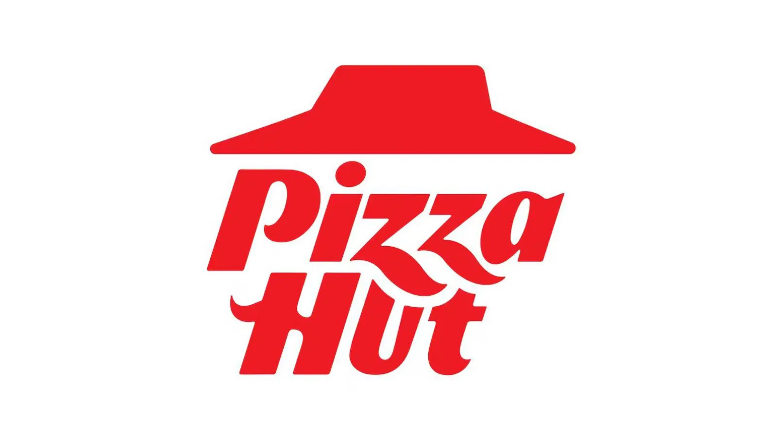
Unlike the previous version that paired the red roof with black text, the new identity commits fully to red, making it bolder and more unified. The typography also plays a subtle visual trick. Sharpened “Zs” now descend into the “Hut,” creating a more cohesive and modern appearance.
The move suggests an intent to bring previously disconnected regional identities into closer alignment, particularly for markets that missed the 2019 refresh wave. According to Marketing-Interactive, APAC markets are likely to receive the update next.
How Pizza Hut is tying in cultural relevance
The logo update is rolling out alongside a new global campaign featuring none other than nine-time GRAMMY winner Anderson .Paak. Dubbed “Adultzz Only,” the campaign leans into a humorous, offbeat tone that aligns with modern brand playbooks. Less polished, more personality.
In a cinematic-style ad, .Paak embodies a fictional Pizza Hut therapist, Dr. .Paak PhD (Pizza Hut Degree), offering unconventional life advice to his DJ alter ego PeeWee as they deal with pizza dilemmas. The campaign promotes the brand’s latest menu item, the Crafted Flatzz, a flatbread-style offering designed to catch the attention of more adventurous eaters.
This kind of storytelling, quirky yet self-aware, signals Pizza Hut’s shift toward edgier, culture-first marketing. For brand strategists, it’s a case study in how nostalgia, humor, and new formats can work together to reposition a familiar name for a younger audience.
Local campaigns show how brand refresh plays out on the ground
Beyond the global rollout, Pizza Hut’s local teams are flexing their creative muscles to make the brand feel homegrown and culturally relevant.
- In Singapore, the brand fused food and fashion with a Thai-inspired menu (green curry pizza, tom yum melts) and its first streetwear drop, created in collaboration with local collective Tell Your Children.
- In Malaysia, Pizza Hut tapped into national sentiment for Merdeka Day with the “Ini Rumah Kita” campaign, inviting 68 artists to reinterpret the brand’s iconic red roof as a symbol of “home.”
- Productized merch is also trending. Both markets released playful plushies, ranging from garlic bread and spaghetti in Malaysia to a cheeseburger melt character named “Sir Melts-a-Lot” in Singapore.
These hyper-local activations work because they anchor Pizza Hut in culture while staying aligned with the brand’s evolving global identity. It’s a strong example of how to localize a global campaign without compromising brand consistency.
What marketers should know
For marketers and brand leaders, Pizza Hut’s refresh offers a few key takeaways:
1. Brand consistency still matters, even in a post-logo world
While minimalist, typeless logos may work for tech unicorns, legacy F&B brands like Pizza Hut benefit from recognizable, unified branding. A refreshed logo doesn’t mean starting over. It can be a tool for brand harmonization across markets.
2. Use nostalgia to evolve, not to regress
Pizza Hut’s revival of the red roof taps into warm familiarity, but the new typography pushes the brand forward. Marketers should note how this blend of retro and modern strikes a balance between loyalty and relevance.
3. Cultural fluency isn’t optional
The success of Pizza Hut’s local campaigns in Southeast Asia shows the power of in-market creativity. Local teams leaned into culture, language, and humor to keep things fresh while maintaining the core brand.
4. Creative consistency needs freedom to flex
Pizza Hut’s global identity update didn’t restrict creativity. It enabled it. With a more cohesive look, local markets had room to play with campaign ideas that would land more meaningfully.
Pizza Hut’s new logo might seem like a minor update, but it’s part of a larger shift toward a more cohesive, culturally resonant brand presence.
For marketers, the lesson is clear. Don’t overlook the strategic potential of visual identity refreshes. When paired with smart campaigns and local flair, even subtle brand updates can deliver major business impact.